Abode
Abode is seeking to upend the housing market in the UK. With a dynamic identity Abode wants to appeal to home buyers previously locked out of market.


Logo
At its core the logo is based on wooden toy building blocks referencing stability, strength and a tradition of quality housebuilding. With the wider identity Abode wanted to reach out to traditionally locked‑out demographics: younger people unable to get on the housing ladder, and older retired people wishing to remain active and independent. The identity needed to set the company apart from established players in the industry, as community‑centric, diverse, approachable and joyful. It would need a single identity that could flexibly appeal to both of their core demographics.
Influences

Friedrich Froebel’s created the concept of the kindergarten, and part of his joyful approach to learning was creativity through learning with building blocks.

Dry stone buildings are among the oldest permanent homes such as the borie (top) in the Langue-d’Oc, with interlocking stones and pitched roofs.

Portugese azulejo tiles - simple tesselating shapes and patterns in bright colours.
Tiles
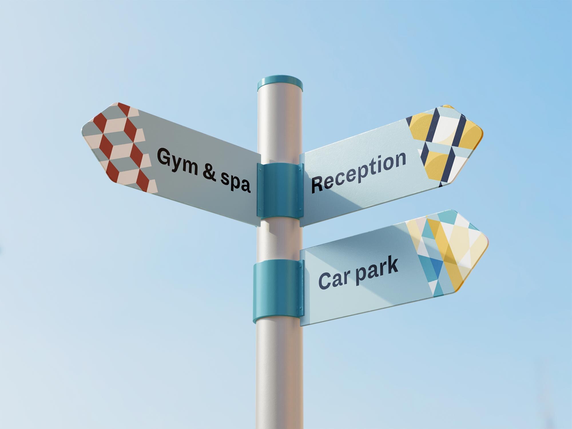
Primarily based on Portuguese ceramics as well as traditional Victorian entryways, the shapes of the brand and site logos were disassembled to create bespoke “tile” patterns forming the basis of the brand identity.


Two distinct styles
Two distinct styles will be employed for the same patterns to create project two different moods: one for more formal situations, another for bolder, more eye‑catching applications. They share the vibrant colours but function very differently.